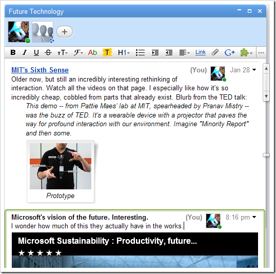
In most of the Google Wave waves I use, it would make more sense to have the blip-creator thumbnail and name changed to be right-aligned, basically what I’ve mocked up below.

This style is less disruptive to the overall document’s formatting, and makes the wave look much more cohesive and professional. For chat-style exchanges, it’s important to keep what is said closely linked to who’s saying it, but when collaboratively editing, it’s rather unnecessary, and turns out to be more distracting than anything else.
[Continued 10 minutes after realizing this would actually be doable with Stylish]
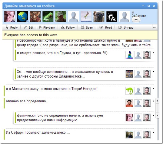
Here I present to you, the smallest style with the largest impact for Google Wave: Now all of my waves look like this (except they’re not in Russian).

The names of the blip’s contributors are hidden, as well as the time/date (I don’t need either one near enough to justify how much they mess up the formatting of blips). The drop-down menu is made smaller but still displayed. The good part for you is that each part is incredibly easy to hide or show; the CSS is below, and if you want to hide or show the time, names, or menu, just add or delete the appropriate item from the list!
Want it quick? Firefox users, install it from here as a Stylish style or a Greasemonkey script. I also threw together a simple Chrome extension.
.GTB[dc=contributors] {
float: right !important;
margin-right: 0 !important;
margin-left: 2px !important;
}
[dc=menu] {
width: 9px !important;
}
.MTB[dc=time], .KTB[dc=names] {
display: none !important;
}